OrganScore Edition Readability
When working on a piece, musicians gradually solve technical difficulties while internalising the musical text, with the ultimate goal of memorising these elements. Many instrumentalists also perform from memory — pianists in recital, for instance, almost always do so.
For organists, the situation is similar in principle. However, because of the nature of the instrument and its repertoire, organists very often rely on the score while playing.
As a result, the score is essential not only during practice, but also in public performance. From the outset, I wanted OrganScore to be fully suited to both contexts. This required numerous optimisations. Eliminating page-turning issues is a central one, but achieving excellent readability is equally important.
Before going into further detail, it is worth mentioning that the notation software used throughout the OrganScore collection is Finale (MakeMusic). Its exceptionally flexible engraving engine has made it possible to optimise both page layout and readability. This work has primarily involved careful adjustment of the following parameters:
- choice of music font,
- note and staff size,
- line thickness,
- beam thickness and spacing,
- horizontal note spacing,
- vertical spacing between systems and staves,
- distribution of voices across staves.
Describing the full extent of this research would be both lengthy and of limited interest. What follows therefore focuses on a few key aspects.
Musical Notation Font
Since the advent of notation software, a wide variety of digital music fonts has become available. Among these, several are widely used and well regarded (Maestro, Opus, Sonata, Petrucci, among others). Most are well proportioned and offer good readability.
After extensive testing — particularly with regard to notehead size and shape — my choice settled on Maestro, the font supplied with Finale. Its proportions are excellent, and its noteheads are generous without being heavy. Combined with carefully chosen line thicknesses, it provides a very comfortable reading experience.


Staff Size
Traditional organ and piano scores typically use staff heights ranging from approximately 6 mm to 7 mm. Given the goal of eliminating or minimising page turns, it was not always possible to use the upper end of this range. OrganScore therefore generally employs staff sizes between 6 mm and 6.5 mm.
For comparison, the famous Bach-Gesellschaft Ausgabe (BGA), when printed from IMSLP scans on A4 or US-Letter paper, typically yields a staff height of around 6 mm.
In practice, this range has proven entirely sufficient for excellent readability. Readability is not determined by staff height alone, but also by careful control of other parameters (font choice, line thickness, spacing, etc.), as well as by modern laser printing. In fact, a well-engraved 6 mm staff can be easier to read than a poorly engraved 7 mm staff in older editions, where thick lines, small noteheads and awkward beam proportions often obscure the musical text.
Line Thickness
Line thickness — for staff lines as well as other notational elements — is a crucial but often overlooked parameter. In traditional offset printing, lines tended to be relatively thick because the paper absorbed the ink. Modern laser printing allows much finer control.
In OrganScore, several principles are applied:
- Staff lines and stems are as thin as possible while remaining clearly visible, so that noteheads and beams stand out clearly.
- Beams are carefully balanced in thickness and vertical spacing, and are prevented from crossing staff lines (an optimisation supported by Finale).
- Barlines are slightly thicker than staff lines, providing clarity without heaviness.
Examples
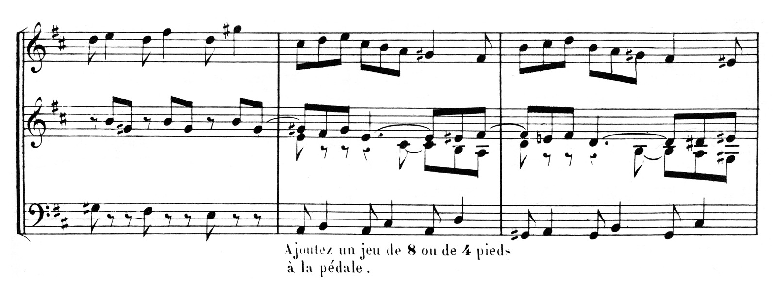
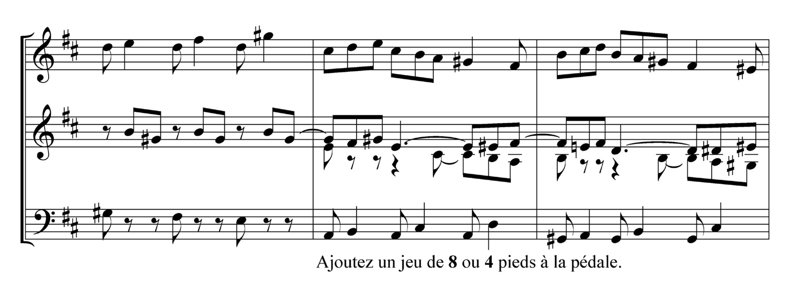
Here are a few examples of the result of using Finale and Maestro, by comparison to an old edition.


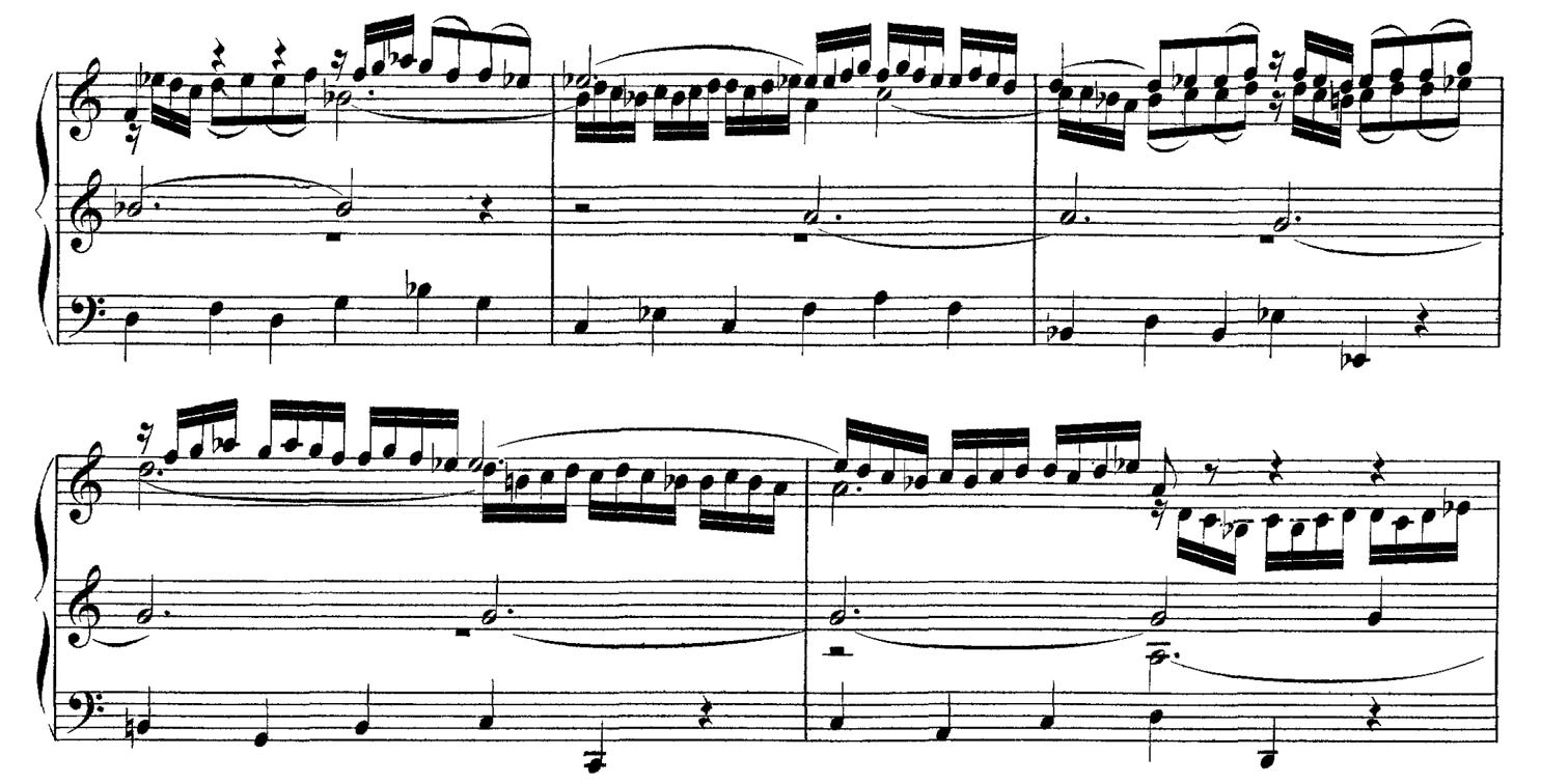
Another example to illustrate Finale/Maestro :


Note Spacing
Horizontal note spacing in OrganScore follows traditional engraving principles. The minimum spacing allocated to a given rhythmic value is approximately 1.618 times (the golden ratio) that of a note of half the duration. This represents a minimum value: when voices overlap vertically, alignment constraints may require larger spacing ratios.

Once this proportional rule is established, a basic spacing value (usually based on the quarter note) must be defined. This value is chosen individually for each piece — and sometimes for different sections within a piece — depending on musical context. Selecting this basic spacing is a key optimisation step, subject to several constraints:
- it must suit the rhythmic character of the music (for example, spacing appropriate to 6/8 is unsuitable for 3/2);
- it should favour relatively compact spacing where possible, aiding comprehension and helping to minimise page turns;
- it should avoid disturbing variations from one system to another, which impair visual continuity.
The large format of OrganScore pages, combined where necessary with occasional measure splitting, makes it possible to balance the number of measures per system and avoid such irregularities.

Clefs and Key Signatures
For clarity, OrganScore uses only treble (G) and bass (F) clefs — never C clefs. Key signatures follow modern tonal conventions, regardless of manuscript practice. For example, D minor consistently includes B-flat, G minor includes B-flat and E-flat, and so on. An exception is made only when the title explicitly specifies a mode (e.g. Dorian, Phrygian).
Paper Choice
Although black ink on white paper provides maximum contrast, such contrast can be tiring over long periods, especially under strong desk lighting. Readability studies show that a slightly warm background colour improves visual comfort.
For this reason, high-quality music editions — like fine book editions — are traditionally printed on cream or ivory paper (see article on this topic). OrganScore follows this practice. The paper used has the following characteristics:
- ivory colour,
- slight gloss to enhance print sharpness,
- sufficient weight (120 g/m²) to prevent transparency and allow firm, reliable page turns.
Conclusion
It is difficult to quantify precisely how each OrganScore volume has been optimised. Readability is not a purely scientific or objective criterion. What can be stated with confidence, however, is that OrganScore succeeds in eliminating page-turning problems without compromising readability. Staff sizes remain comparable to those of traditional organ and piano editions, and in many cases readability surpasses that of older reference editions such as the BGA.
I have personally used these scores for many years with great satisfaction, and I hope that many other organists will share the same experience.
Examples to Print
Some organists ask: “Are your scores easy to read?” or “Are the staves and notes large enough?”. If you have read this article, you already know the answer. They are at least as readable as traditional organ scores — and often more so, thanks to balanced spacing and modern printing.
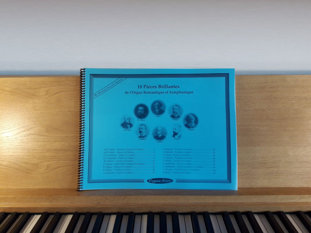
The most convincing demonstration, however, is to see them for yourself. The following PDF extracts may be downloaded and printed on A4 or US-Letter paper. For accurate rendering, please set the print scaling option to “No scaling”:
BWV-525-1-Extract-200×265-(Print-with-no-scaling).pdf
BWV-526-1-Extract-200×265-(Print-with-no-scaling).pdf
BWV-541-1-Extract-200×265-(Print-with-no-scaling).pdf
Boely-Extract-200×265-(Print-with-no-scaling).pdf
Boellmann-Toccata-Extract-200×265-(Print-with-no-scaling).pdf
Gigout-Toccata-Extract-200×265-(Print-with-no-scaling).pdf

